First up, if you missed part one of this series and are wondering what this is all about, head here and give our introductory (and hopefully inspirational) blog a read.
THE IDEA
A little background to start. A couple of years ago, fed up with the professional pigeonholing so rife in the job market, I decided that a video resume might be a better way to get my message across. Something that would speak louder to the time-pressed skim-reader, and bypass those unimaginative, keyword-crazed search tools altogether.
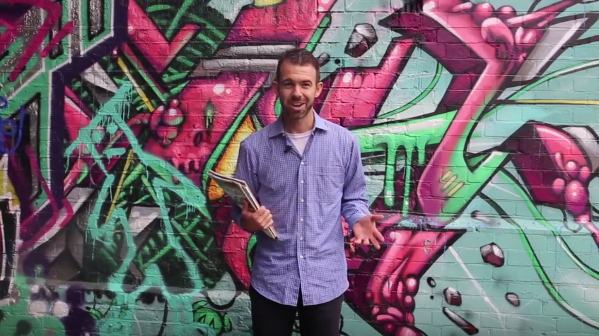
I wrote a script, spent hours in the middle of a field rehearsing the words, hired a cameraman and ironed a shirt. Three hours of filming in London (in the graffiti hub that is Shoreditch, if you’re curious) later, we had all the footage required. After the tedious business of video editing – the cameraman took care of that, too – a video CV was finally born. You can watch it below.
Now to the genesis of the business idea itself. The response to that video CV – both execution and concept – was overwhelmingly positive. And when you get a resounding approval from all and sundry, and hear people say things like ‘I should get one of those…’, it gets you thinking. If the reaction to what we’d done was so good, could my cameraman and I start making CV videos for others? Would they be willing to pay for such a service?
It didn’t seem a completely mad idea to think that people might consider it a worthwhile once-off investment to get a proper CV video made. And that they might want to hand over as much of the creative concept and technical donkey work to an experienced specialist.
It’s true that by its very nature this would be a highly individualized service. Like tailoring a suit, it’s not something you could automate or scale all that easily. The hours involved would mean a fairly chunky fee. But if you think about such issues before you’ve even found out whether people are interested in your product, then you’re putting the donkey before the wagon. It seemed worth a little trial at least.
A trial that deliberately avoided a serious ad budget and the use of any web development skills. In other words, a trial that anybody could copy.
And even if we messed it up, our readers could learn from our mistakes…
THE TEST
We took the risk of running this test over the holiday period. Our Facebook advertisement campaign ran from December 27th until January 2nd. The thinking? Yes, most of the world is offline, but equally, that time of year is the number one week for reflection and resolutions. More than at any other moment, people think about major life changes during those few days. In that sense, there couldn’t be a better slot for a pop-up offering the chance to make a fresh new resume. One that might lead to a fresh new job.
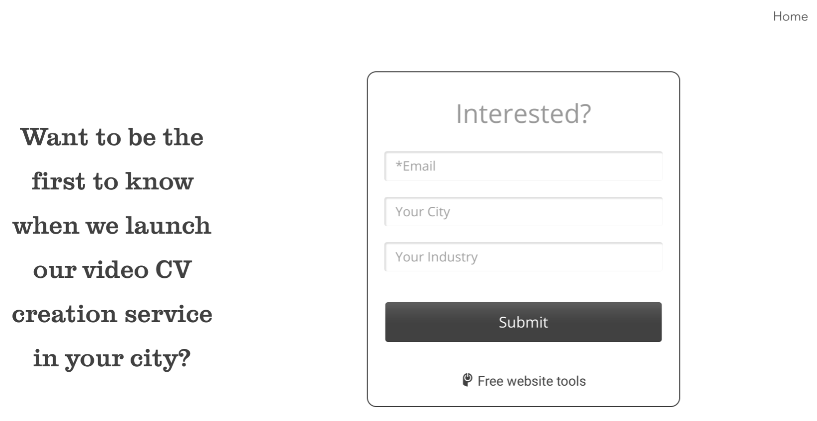
Facebook’s targeted adverts seemed as good a place as any to start. First, though, a landing page had to be made. Using Wix.com, the market-leading website builder hailing from the startup hub that is Tel Aviv, we threw one together in double-quick time before the holidays began. It wasn’t pretty and didn’t pretend to be: basic is the word. Just a homepage. The embedded CV video was the centerpiece. It was paired with a simple drop-in sign-up form that allowed us to access names and emails directly within Wix.

It was nice to discover the latter feature. We had thought a MailChimp account setup would be on the cards, but this proved not to be necessary. Good! When you’re testing business ideas on your lunch breaks, the last thing you want to be doing is spending precious minutes signing up for ten different accounts and learning to navigate any more platforms than necessary.
The site also had a custom domain, which made it look like ‘CV Film Studios’ was a proper company, rather than the made-up experiment that it was. Generally custom domains mean parting with cash, but we did this without paying a dime. That’s because with Wix.com, you can go for a premium plan (which includes custom domains) and then get a refund if you cancel within fourteen days. Which we’ve subsequently done. For an advertising experiment, two weeks can be enough of a lifespan for a website. Your work will be saved in your account anyway, so you can always re-activate and improve the site if you want to pursue the idea further.
We also added Google Analytics to the site, which is simple enough on most platforms. Depending on what web building service you use, this may be a premium feature. Again, take advantage of free trials! Google Analytics is worth having for the information it tells you about anybody who does end up visiting your site.
We then set up a Facebook page for CV Film Studios. Through this we planned an advert and a post that we’d boost with further cash when it went live. Both would feature the video CV people liked so much. For the advert, this needed to be uploaded, while for the post it was possible to simply use the YouTube link.
The general idea? Put the video in front of the right people, and hope they watched enough of it to think, ‘That’s cool, I want one! Where do I sign up?’
Ideally, they would then actually sign up.
The ad post offered the possibility to include a simple sign-up form as part of the advert, an option we jumped at. We defined sign-ups (leads) as our goal here. The page post didn’t offer a form (go figure), so the hope there was simply driving traffic to the website, where our alternative sign-up form lay in wait. And here, in the pre-Christmas rush, we messed up the goal-setting: it should obviously have been click-throughs, but somehow we picked impressions.
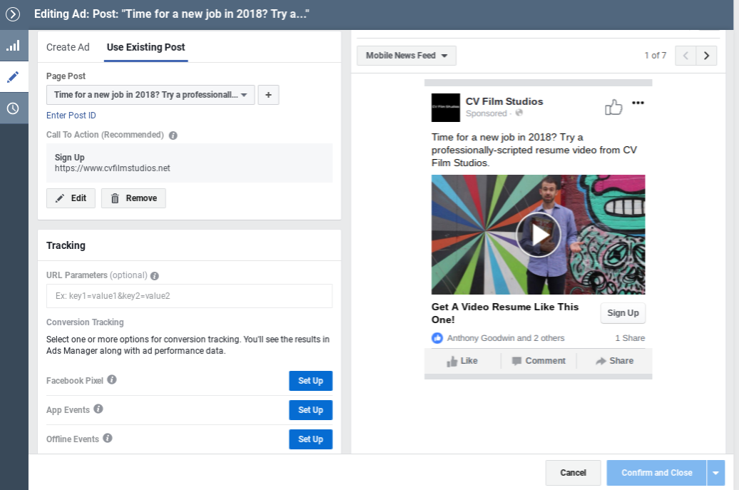
Anyway, here’s a look at the construction site for our page post!

Using Facebook’s extensive array of demographic options, for both adverts we targeted an 18-45 age range in the United Kingdom only. There was no specific gender targeting, but we were able to hone in on people who described themselves as ‘job hunters’ or similar. Facebook also offered the possibility to target those who had at some point expressed an interest in the term ‘video resume’. Naturally, we did that too.
THE RESULTS
We’ll skip the details and keep to the basics here. Overall, we ‘reached’ 7,294 users, with the ‘impression’ count at 12,198. In essence, that means a lot of those users saw the advert or post multiple times.
When it came to engagement and views (three seconds of watching time defining a video view), more women came to the party, with a 56% female bias. Around 46% of the viewers and engagers fell into the 35-44 age bracket, with a clear peak in the hours between 1pm and 3pm. All potentially useful information about a possible audience.
Whether that really was an interested enough audience, however, is debatable at best. There were just four likes and one share on the page post, and a three-second view of a six-minute video probably doesn’t count for a lot.
Four people signed up to the form on the advert, which is hardly a terrific return. Still, it was better than the signup count on the form we’d put on our website, which we may best describe as four fewer signups than we achieved on Facebook.
It’s not like casual viewers flocked to the website in droves either. Google Analytics tells us we had 16 visitors (thank heavens we didn’t actually pay for the premium plan in the end), 14 of which came – logically enough – from the United Kingdom. One American and one Peruvian also popped in for a look. Unsurprisingly for a time of year in which offices are barren, 100 percent of the traffic came from mobile devices. More curiously, half of it came from ‘direct’ sources. In other words, not from Facebook. A hard one to fathom.
For a comparable spend, the page post outperformed the advert roughly threefold in terms of reach and impressions. Overall, we put around 70 Euros into the campaign. It could have been less, of course: you can set whatever spend limits you like.
Those four signups came at a cost of around 8 Euros each: way too much, you’d think. Impressions, overall, only cost a couple of cents each, but only a handful led to the click-throughs (and then website sign-ups) we actually wanted.
But hey, two of those four sign-ups came from the relatively insignificant city of Reading. Coincidence, or a tiny little nugget to work with on the next campaign, perhaps?
Or maybe we’ll just leave it there. Experiments don’t always deliver the results you want, but we’ve heard it from enough founders in our community: rather try something and fail than try nothing at all. Most ideas don’t work, and that’s perfectly normal.
And remember, we didn’t need to quit our day jobs to do this little test. And you don’t either…
PRACTICAL LEARNINGS
-
If you’re going to need profile or cover pictures for a Facebook page or similar, get these sourced and correctly sized before you do anything else. Otherwise they’ll be an irritating speedbump when you’ve got a nice flow going on the creative stuff. If you need a photo or two, help yourself to a few via the free trial from Adobe Stock.
-
Another thing to do up front is choosing your ‘company’ name and picking your web builder plan. When that’s done you can get signing up for accounts such as Wix and Google Analytics out of the way. Type your cat’s name twice and let your browser save it once and for all. Then you can start some real work.
-
Get Google Analytics up and running on your website before you upgrade to premium and start your campaigns running. It can take a few days to get the data flowing. Test that it’s all working by getting a few friends to visit your site: you should see it in real-time when they load it up. Remember that you may need to manually ‘activate’ a few specific aspects of demographic data-gathering.
-
Whatever your advertising method, think very carefully about your goals up front. Is it sign-ups? Click-throughs to your page? With Facebook, at least, it’s the first question you answer, and one around which every subsequent step and your budget spend is built. Changing your mind on your goal at the last minute means doing everything again. And if you’re doing this in your time-squeezed evenings, that’s a catastrophic thing.
-
Don’t rush it. You can fine-tune almost everything before you start playing with real money. Ideally, don’t be on holiday when your ads go live. We did that. Silly.
-
Make sure you keep a daily eye on developments with your campaign. You don’t need to commit your full spend up front. For example you could plan a couple of days, see what works, and then quickly duplicate your ad with one or two small changes. We could have tried switching our audience to the USA after two or three days, for example. This doesn’t take long, but, again…don’t be on holiday!
-
Keep notes of the small tweaks in your campaign, why you did them, and what the results were. It’s not at all easy or fast to trawl through Facebook ad manager and retrospectively look at what you changed and when.
-
If you’re hoping that embedding your YouTube link in a Facebook post you’re paying good money to boost will kick-start your YouTube channel into viral territory, the news is not good. None of those views show on YouTube itself. Not cool, but there you go.
-
While we thought sharing the final video product would logically be the best advert for a CV video service, a six-minute video is not ideal to grab an audience on Facebook. The platform itself recommends 15 seconds as ideal, with the first three seconds critical. Keeping it under a minute also means you’ll have the option of Facebook distributing the video on Instagram too.
- Even with the basic version of ads manager, setting up Facebook ads is slower and more confusing than it might be. The multi-layered structure makes sense for professionals running multiple campaigns over a period of time, but it’s frustratingly complex for a part-timer who just wants to run a single ad or two. That said, learning the basics is time well invested if you’ve got a bunch of ideas you’d like to trial.
If you try a startup marketing experiment of your own, let us know via our social channels! We’ll definitely give your post a like…
